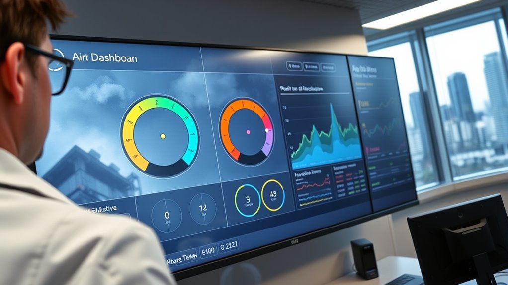

Air quality dashboards visualize real-time pollution data from sensors across your community, giving you instant insights into air quality levels. They display information like particulate matter, nitrogen dioxide, and ozone through color-coded maps and graphs, making it easy to interpret pollution trends and spikes. Proper sensor calibration guarantees data accuracy, which builds trust in what you see. Understanding how these dashboards work helps you make safer outdoor choices—if you keep exploring, you’ll discover how these tools truly benefit your health.
Key Takeaways
- Air quality dashboards display real-time pollution data through visual tools like maps, graphs, and alert icons for quick understanding.
- Proper sensor calibration ensures accurate, trustworthy data that reflects true pollution levels, enhancing dashboard reliability.
- Visual elements such as color-coded maps and trend graphs help users interpret pollution levels and respond appropriately.
- Data privacy measures anonymize private sensor data and secure information, maintaining user trust and confidentiality.
- Combining accurate data with user-friendly design supports safe decision-making and effective health protection.
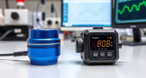
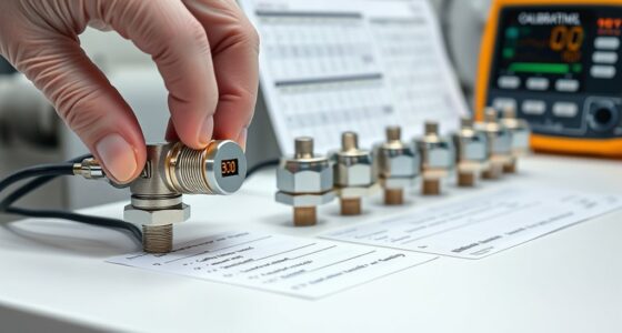
Air quality dashboards provide real-time information about pollution levels in your area, empowering you to make informed decisions about your health and daily activities. When you check these dashboards, you’re accessing a constantly updated visual display of data collected from various sensors placed throughout your community. These sensors measure pollutants like particulate matter, nitrogen dioxide, ozone, and other harmful substances, giving you a clear picture of the air you breathe. However, the accuracy of this data depends heavily on proper sensor calibration. If sensors aren’t calibrated correctly, the readings could be off, leading you to underestimate or overestimate pollution levels. Reliable calibration ensures that the data you see reflects true air quality, helping you decide when to go outside, exercise, or stay indoors. Knowing that sensor calibration is maintained gives you confidence in the dashboard’s information, making it a trustworthy tool for everyday decisions.
While you benefit from real-time visuals, it’s equally important to consider data privacy. These dashboards often pull data from multiple sources, including private sensors owned by individuals or organizations. You might wonder, who has access to this data? Is your personal information protected? Reputable dashboards prioritize data privacy by anonymizing data streams and implementing secure data handling practices. They ensure that your personal details, location, or any sensitive information remain confidential, preventing misuse or unauthorized access. Being aware of data privacy measures helps you feel secure while using these tools, knowing your participation doesn’t compromise your privacy.
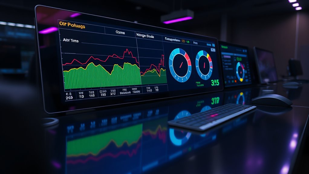
Furthermore, the design of air quality dashboards makes it easy for you to interpret complex data quickly. Visual elements like color-coded maps, trend graphs, and alert icons help you understand pollution levels at a glance. When pollution spikes, you might see a red alert that prompts you to limit outdoor activities, especially if you belong to sensitive groups like children, seniors, or those with respiratory conditions. These dashboards are often accessible via smartphones or computers, ensuring you have instant access wherever you are. Additionally, understanding how sensor calibration impacts data accuracy can help you better interpret the reliability of the information presented. By understanding how sensor calibration influences data accuracy and recognizing the importance of data privacy, you can make smarter, safer choices based on the information provided.
In essence, air quality dashboards are powerful tools that combine technical precision with user-centric design. They offer real-time insights that help you navigate daily life safely, but only if you trust the accuracy of the data and the privacy safeguards in place. Staying informed about how sensors are calibrated and how your data is protected enhances your confidence in these dashboards, making them a valuable resource for protecting your health and well-being.
Frequently Asked Questions
How Accurate Is the Real-Time Air Quality Data Displayed?
The real-time air quality data on dashboards is generally accurate, but it depends on proper sensor calibration and data interpolation. If sensors are well-calibrated, they provide reliable readings, but calibration issues can cause discrepancies. Data interpolation helps fill gaps when sensors temporarily malfunction or miss data, maintaining overall accuracy. Regular maintenance and calibration ensure you get the most precise, real-time air quality information from these dashboards.
Can Users Customize the Dashboard to Track Specific Pollutants?
Think of your dashboard as a tailor-made map, where you hold the compass for pollutant tracking. Yes, you can customize it to focus on specific pollutants, making your data journey more relevant and insightful. Dashboard customization allows you to select and highlight the pollutants that matter most to you, transforming raw data into a personalized story of air quality. You control the layers, ensuring you see what’s truly important.
What Sources Are Used to Collect Air Quality Data?
You gather air quality data from a mix of sources, primarily satellite imagery and ground sensors. Satellite imagery provides a broad view of pollutants over large areas, while ground sensors give precise, real-time measurements at specific locations. Combining these sources guarantees you get thorough and accurate air quality information, helping you monitor pollution levels effectively and make informed decisions to protect public health and the environment.
How Often Is the Data Updated on the Dashboards?
Think of the data refresh rate like a heartbeat—quick and essential. On most air quality dashboards, the update frequency is typically every few minutes, ensuring you get near real-time info. This rapid update cycle helps you stay informed about changing air conditions, much like catching a gust of fresh air when you need it most. You can rely on these dashboards to reflect current air quality, often renewing every 5 to 15 minutes.
Are There Mobile Apps Available for Accessing These Dashboards?
Yes, there are mobile apps available for accessing these dashboards, ensuring mobile accessibility. These apps allow you to check real-time air quality data conveniently on your smartphone. They feature user-friendly interfaces, customizable alerts, and interactive maps to help you stay informed about pollution levels wherever you are. With app features like location-based updates and notifications, you can quickly respond to air quality changes and plan your activities accordingly.
Conclusion
By embracing air quality dashboards, you can make mindful, informed decisions effortlessly. These dynamic displays deliver data directly, driving awareness and action. Don’t overlook their power to protect your health and environment. With real-time readings right at your fingertips, you stay a step ahead, spotting pollution patterns and promoting progress. Harness the helpful, hands-on tool of dashboards—your personal partner in pursuing pure, pristine air for all. Stay sharp, stay safe, and see the significance of sensing your surroundings swiftly.

In the dynamic world of air purifiers and clean air advocacy, Aire stands out as a beacon of knowledge and passion. As the Editor in Chief of Aero Guardians, Aire has been instrumental in shaping the platform’s voice and direction, ensuring that every piece of content resonates with clarity, authority, and authenticity.